new
new
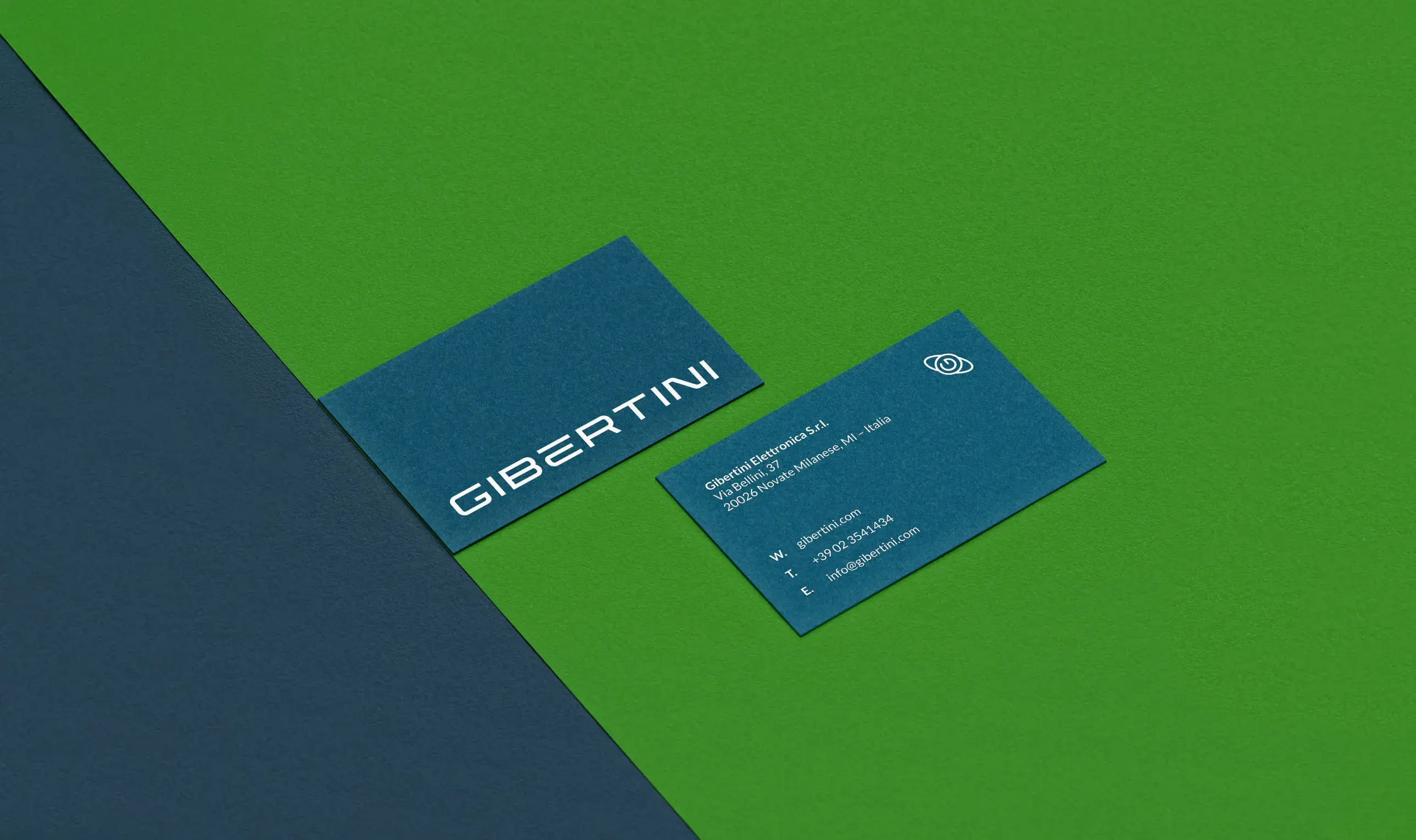
A comprehensive brand identity and seamless UX/UI design for weighing systems that builds upon Gibertini's heritage through minimalism and precision.


The new design adopts a minimalist approach using a limited range of graphic elements. This approach aligns with the precision required in weighing instruments and laboratory applications.

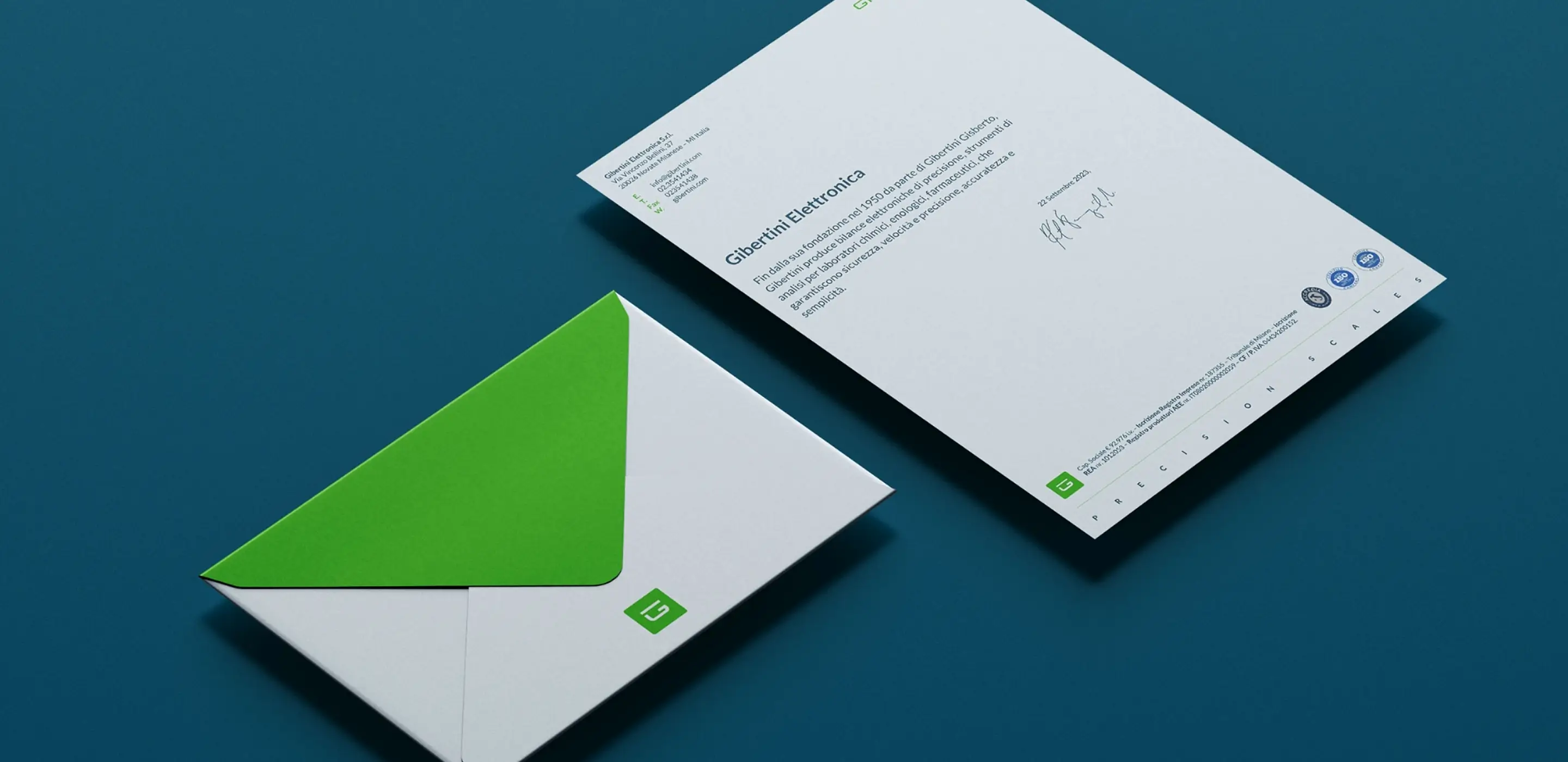
The new identity conveys tradition and innovation, enhancing the company's commitment to providing advanced, high-quality solutions for global weighing and laboratory needs.
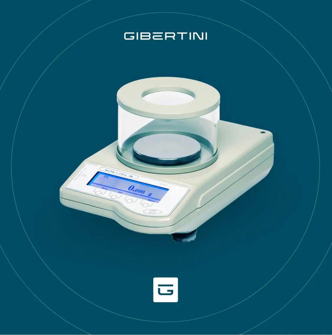
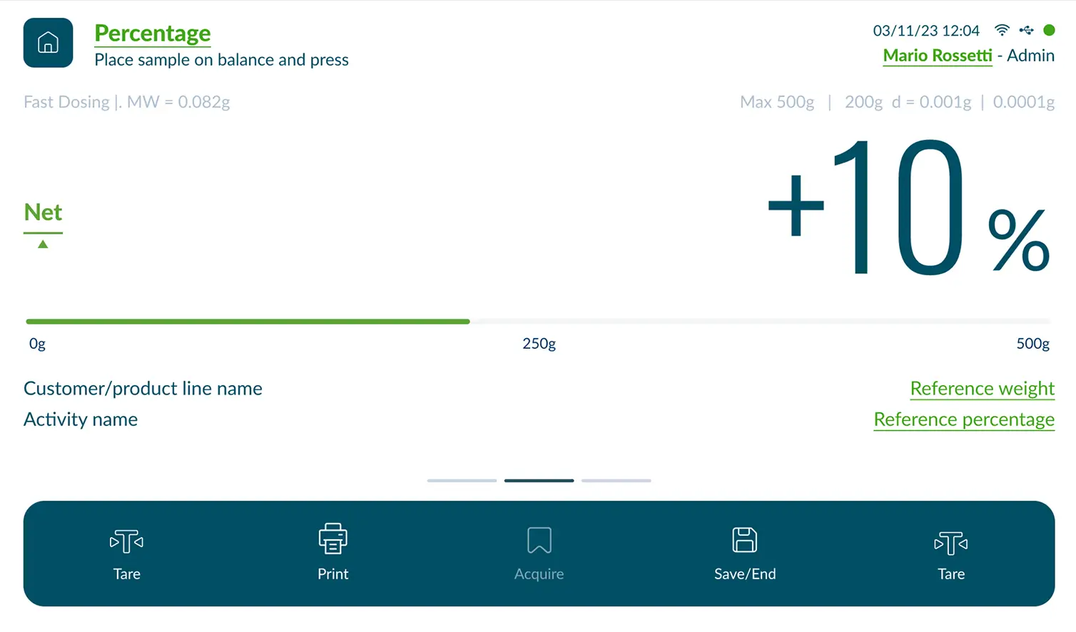
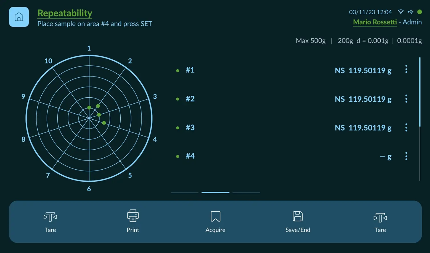
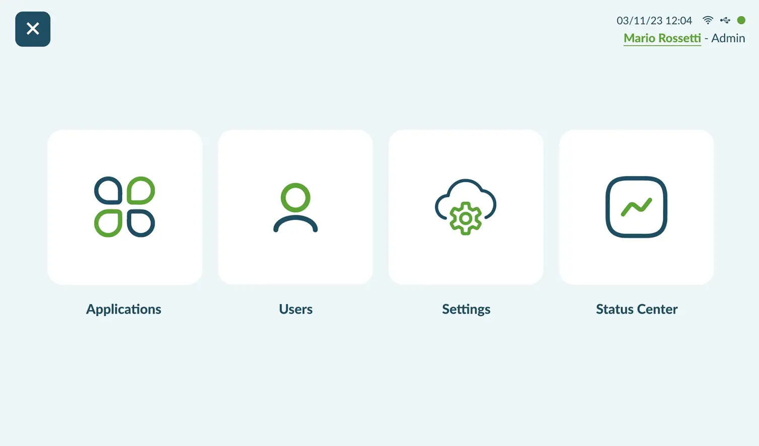
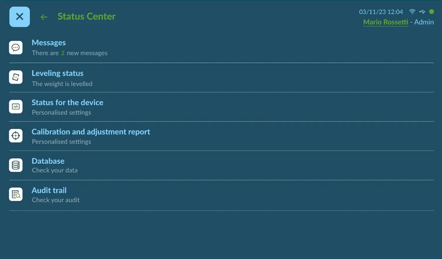
Intuitive interface design that simplifies complex weighing operations for laboratory professionals.
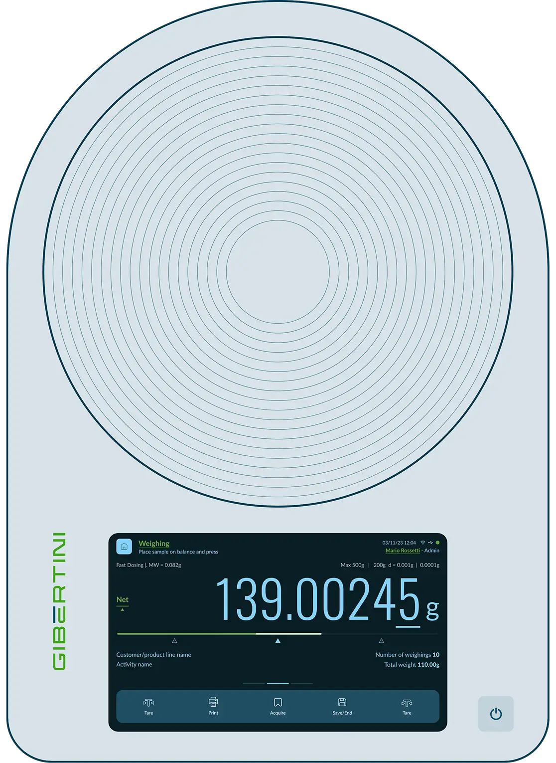
Streamlined user experience that enhances precision and efficiency in daily workflows.
new
new
new
new

new
new
new
new
new
new
new
new
new
new
new
new
new
new
new
new
new
new
new
new
new
new
new
new
new
new
new
new
new
new
new
new
new
new
new
new
new
new
new
new
new
new
new
new
new
new
new
new
new
new
new
new
new
new
new
new
new
new
new
new